Aside
A business account for freelancers that splits every payment the moment it lands: what's yours, and the tax set aside.
- Type
- Self-initiated concept
- Role
- Solo: brand, product design, motion
- Year
- 2026
- Disciplines
- Brand identity, Mobile app
- Built with
- HTML, CSS, JS
In short
A freelancer's balance lies: the payment that just landed isn't all theirs. Aside is a concept business account where every payment splits on arrival into what you can spend and the tax you'll owe. I designed the brand, five app screens, the moment a client pays, and the brand out in the world. Aside is not a real product, and its clients, names and amounts are invented.
The brief I set
A freelancer gets $2,400 from a client. It looks like $2,400 to spend, but part of it belongs to the tax bill that arrives months later.
Apps like Found and Lili already keep a tax bucket, yet the number on their home screen still reads as money you can spend. The job was a brand and an app where the big number is always the truth.
The idea
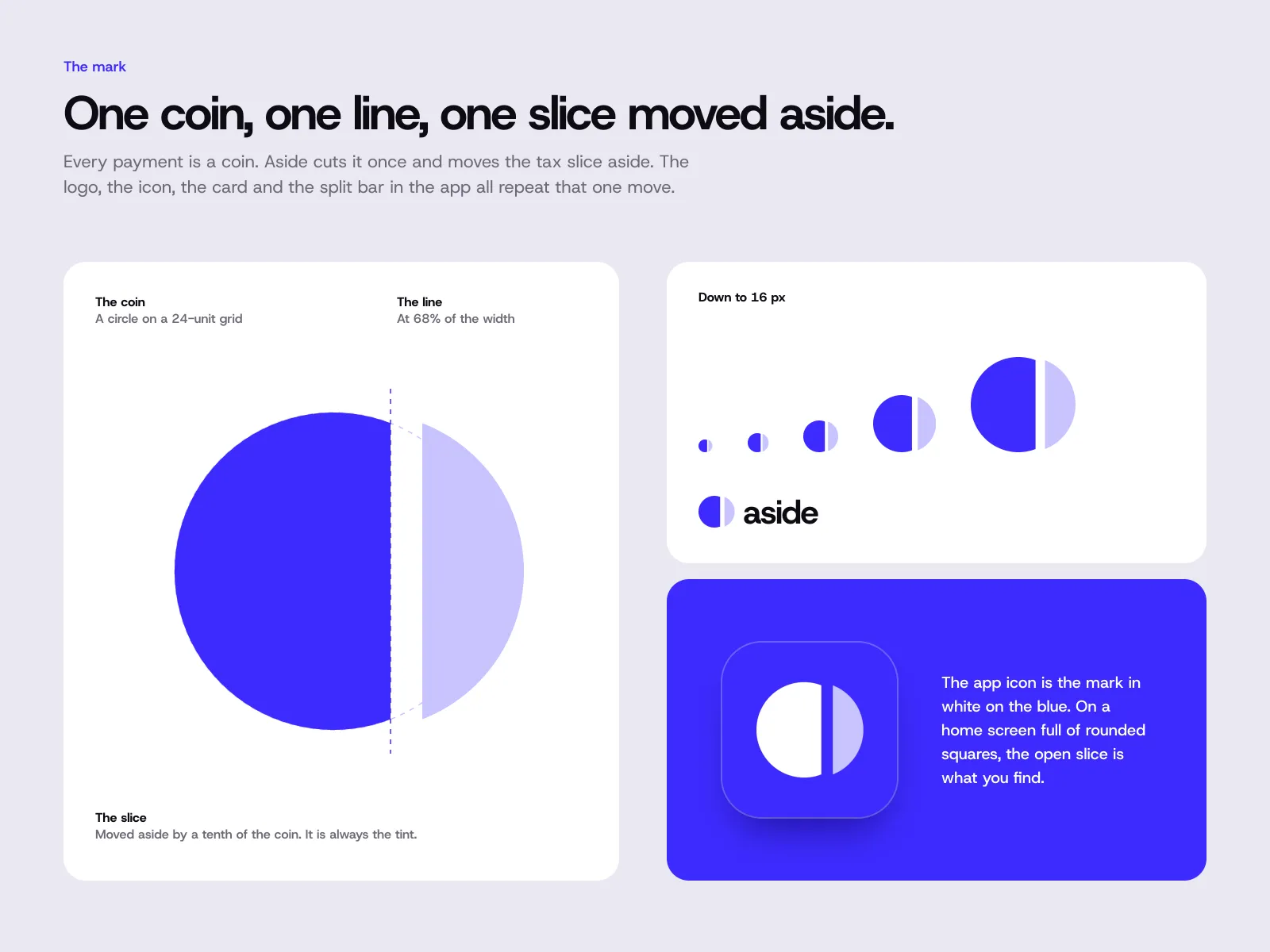
One coin, one line.
Every payment is a coin. Aside cuts it once and moves the tax slice aside. The logo, the app icon, the card and the split bar in the app all repeat that one move, so the brand explains the product before anyone reads a word.
The system
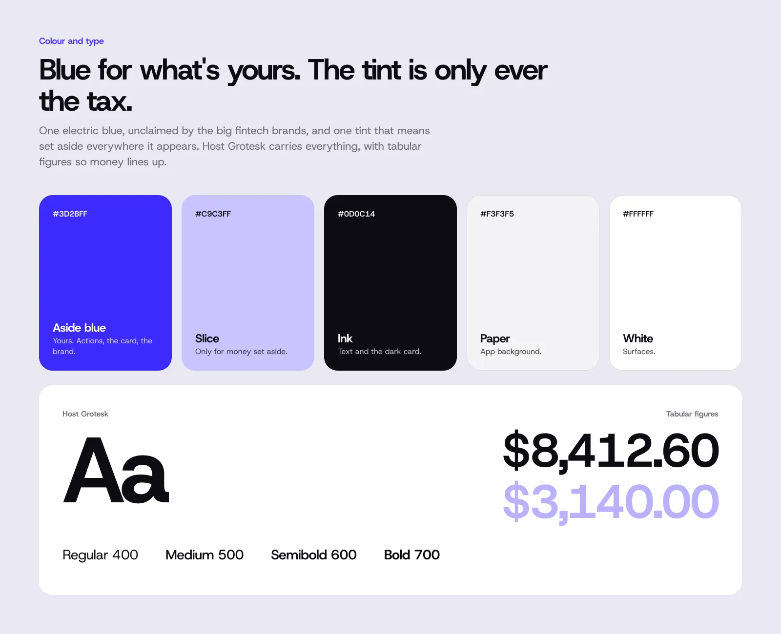
One electric blue, which none of the big fintech brands owns, means "yours". One soft tint means "set aside", and it's never used for anything else. Host Grotesk carries everything, with tabular figures so money lines up.
The app
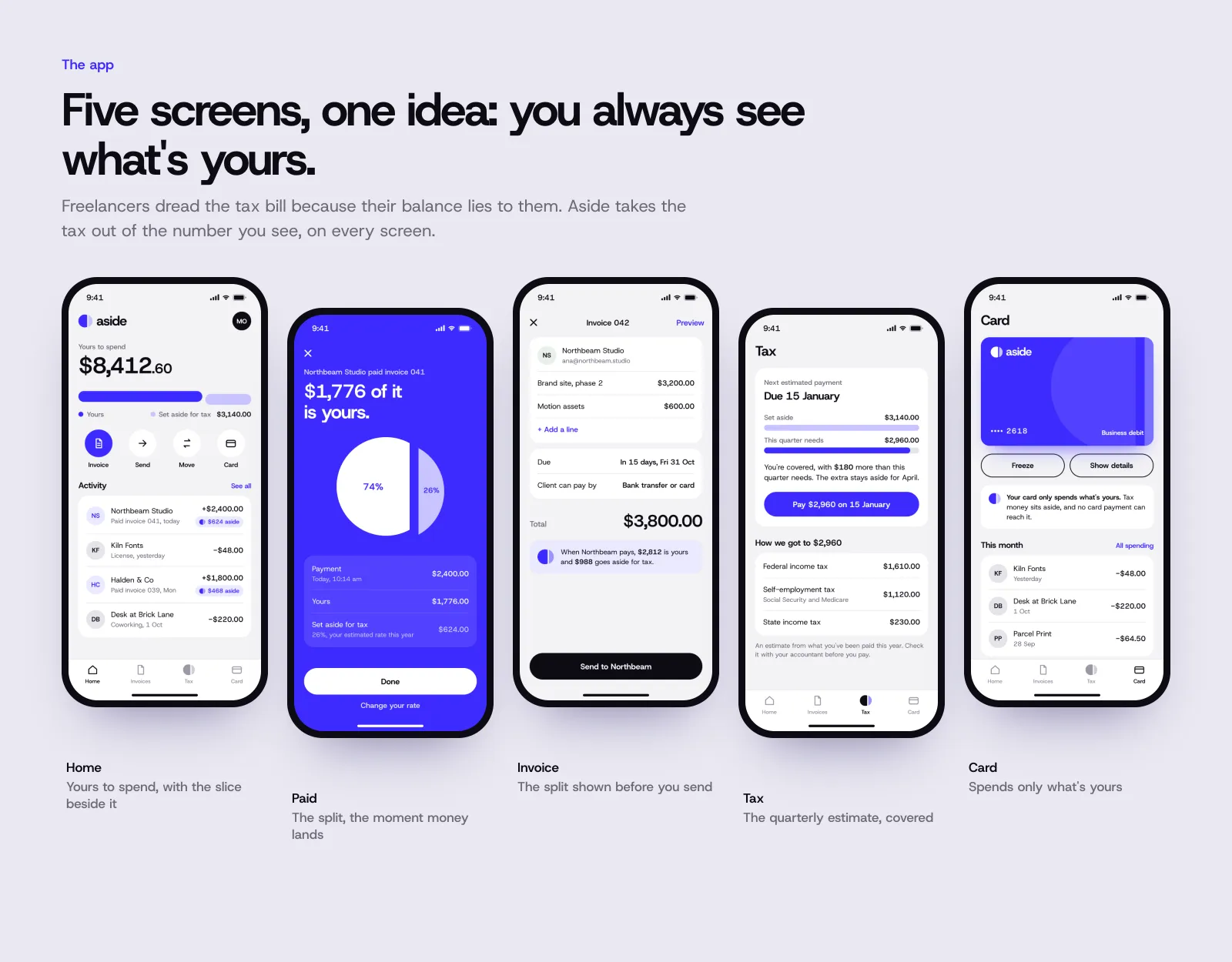
Five screens built around one rule: the big number is always what you can spend. The split shows on the home screen, when a payment lands, on an invoice before you send it, on the quarterly tax estimate, and on a card that can only spend what's yours.
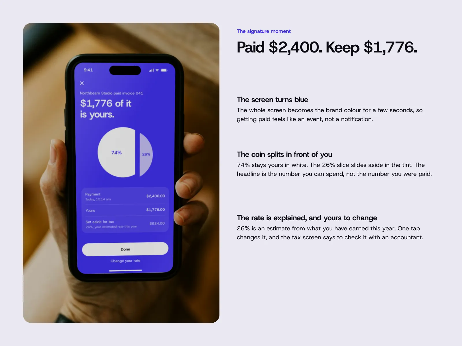
The signature moment comes when a client pays: the screen turns blue and the coin splits in front of you. The headline is what you keep, not what you were paid. The rate is explained in one line and can be changed in one tap.
Out in the world
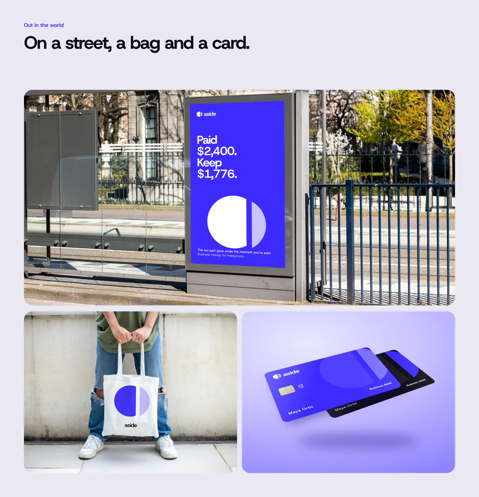
The same split on a bus-shelter poster, a tote bag and two card editions. The photos are from Unsplash, the artwork is composited in perspective, and third-party signage was removed.
Decisions
Aside didn't have a dropped direction worth showing; the coin idea came first and held. The decisions were about keeping it honest.
The big number is always yours
Every screen leads with what you can spend. The full payment is still there, one line down, but it never wears the biggest type.
One colour, one meaning
The tint only ever means "set aside". If it appeared anywhere else, the split would stop meaning anything.
The cut is the motion
In the app and in the launch film, every transition is the same cut: a line drops and the next scene slides in from the side.
Say what you keep
When money lands, the headline is what's yours after tax. Showing the gross first would be the same lie the old balance told.
What I didn't have
Real freelancers, real tax rules for more than one country, and a bank partner. With them, I'd first check whether people trust a balance that is lower than what their client paid, and whether the one-tap rate change is enough or they want to see the maths.