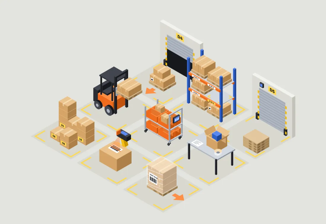
V1Warehouse floor palette
An isometric illustration system for warehouse software, drawn in code so every object snaps to one grid with one light.
Stackyard is concept software for small logistics warehouses. I designed an illustration system that could only belong to a warehouse, with rules tight enough that the next illustration drawn would match, and used it across the product, the handheld app and the website. Every illustration is drawn by a small isometric SVG engine I wrote; there is no stock art. Stackyard is not a real product.
Warehouse software is mostly tables. When it uses pictures, they tend to be stock isometric art: gradient objects floating among clouds and sparkles, which could belong to any app.
I wanted pictures that explain the empty, damaged and no-results moments faster than a sentence, in a style nobody could mistake for another product.
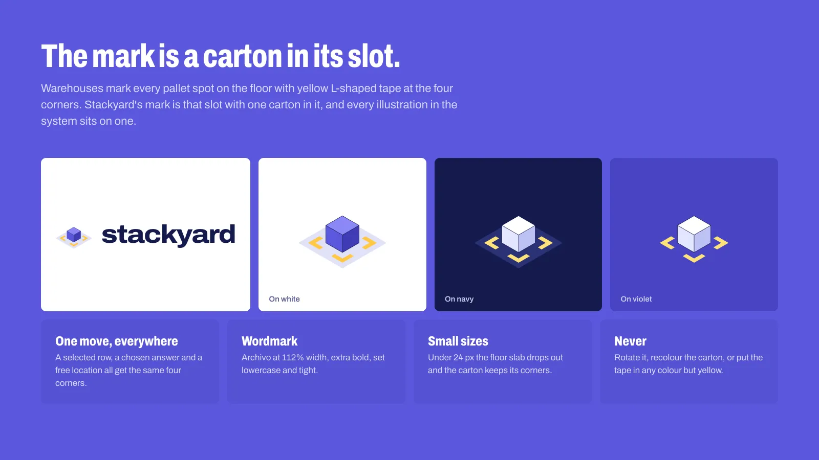
A carton in its slot.
Warehouses mark every pallet spot with yellow L-shaped tape at the four corners. That tape is the whole idea. The mark is one carton in its slot, every illustration sits on a taped slot, and in the product a selected row, a chosen answer and a free location all get the same four corners.
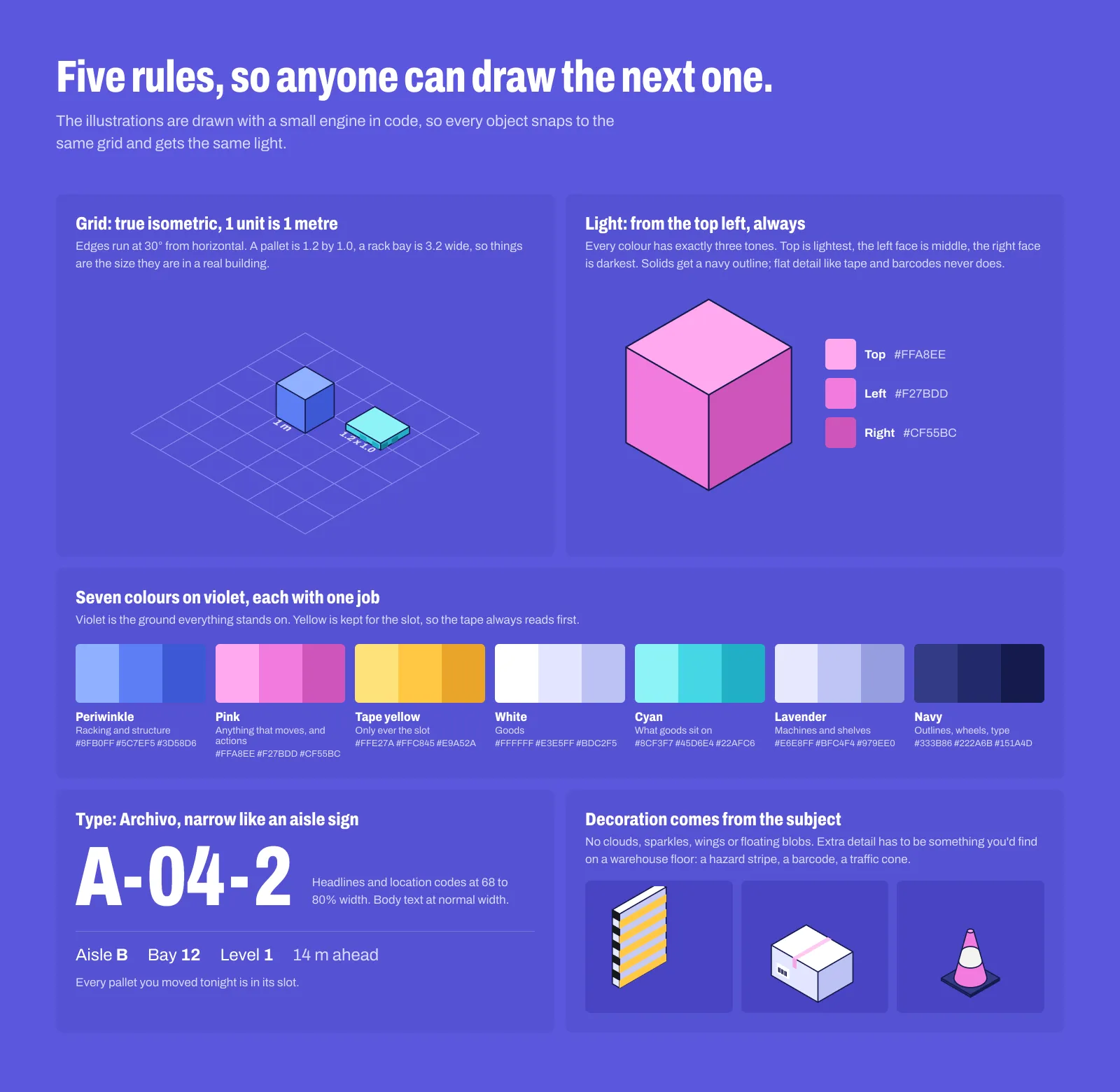
True isometric, where one unit is one metre, so a pallet is 1.2 by 1.0. Light always from the top left, three tones per colour, and a navy outline on every solid. Seven colours on violet, each with one job, with yellow kept for the tape. Archivo, narrow like an aisle sign. Any extra detail has to be something you'd find in a warehouse.
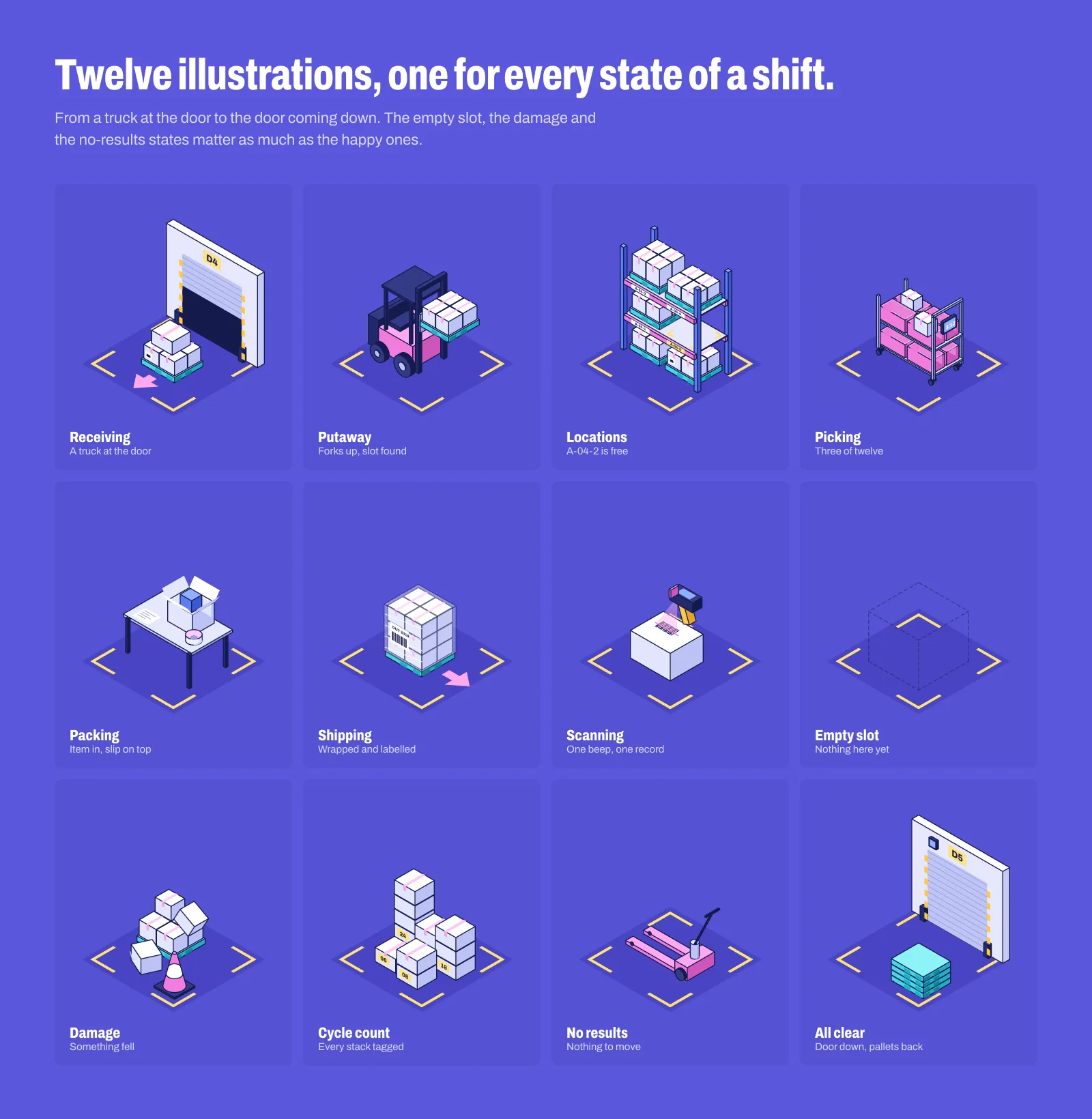
Twelve states of a shift, from a truck at the dock door to the door coming down. The empty slot, the damage and the no-results states get as much care as the happy ones.
In the office, tables and rack maps do the daily work, and an illustration only appears when it means something: a free location to fill, or the one exception of the night.
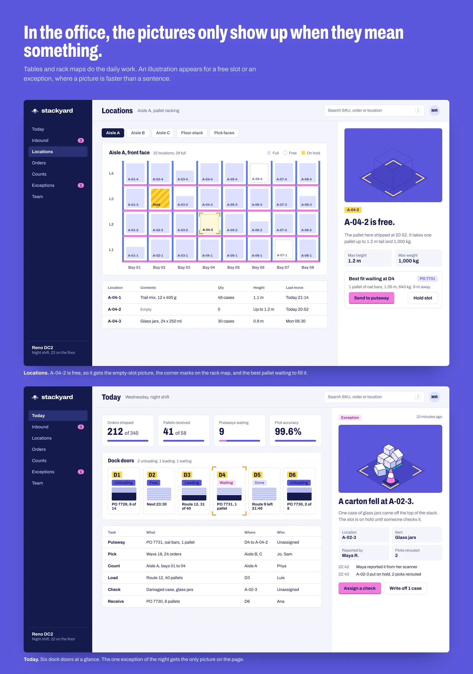
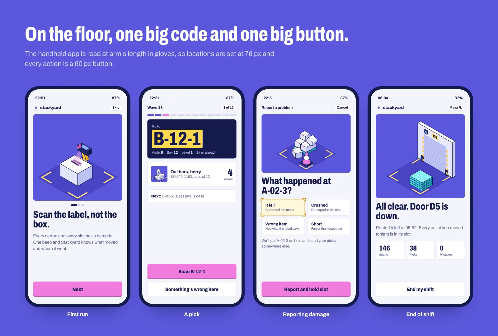
On the floor, the handheld is read at arm's length, often in gloves. Locations are set at 76 px and every action is a 60 px button.
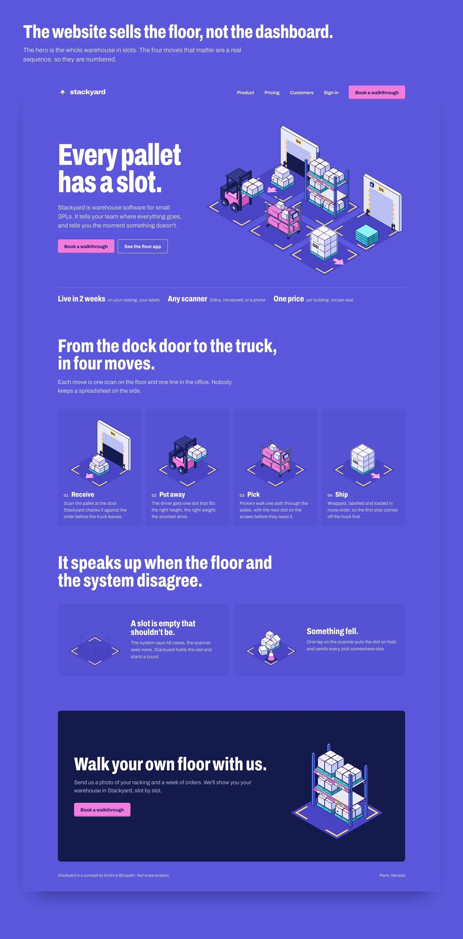
The website sells the floor, not the dashboard. The four moves from dock to truck are a real sequence, so they are numbered.
The first palette came straight off a warehouse floor: concrete grey, rack blue, beam orange, kraft and pallet wood. It was accurate, but the yellow tape had to compete with orange and kraft, and the set read as grey. On violet with navy outlines, yellow is the only colour that loud, so the tape always reads first.
V1Warehouse floor palette
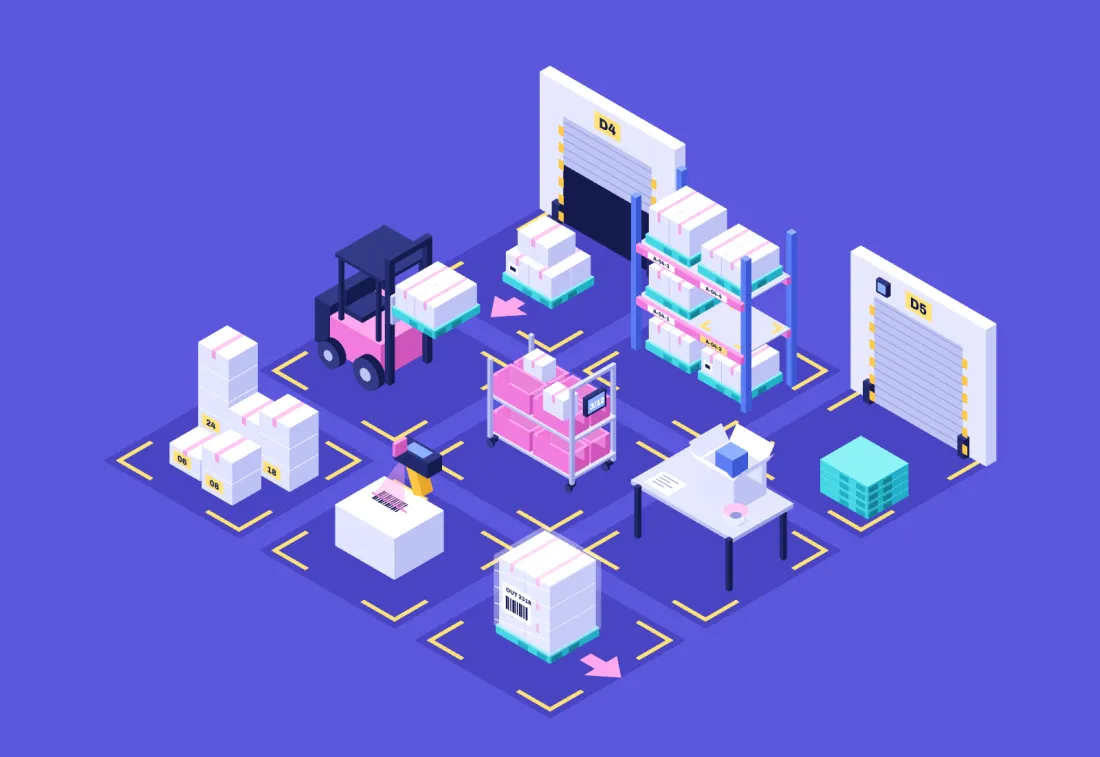
V2Violet, tape reads first
A small isometric engine draws every object, so a new illustration snaps to the same grid, light and outline instead of drifting in style.
Tables do the daily work. An illustration appears for a free slot, a damage report or the end of a shift, never as decoration.
Real proportions keep it believable to people who work in warehouses: a pallet is 1.2 by 1.0, a rack bay is 3.2 wide.
Empty, damaged and no-results states are drawn as carefully as the happy ones, because that's when a picture helps most.
A real warehouse, pickers and a shift to watch. The first thing I'd test is whether the taped-corner selection reads at arm's length on the handheld, in gloves and under warehouse lights, before drawing a single new illustration.