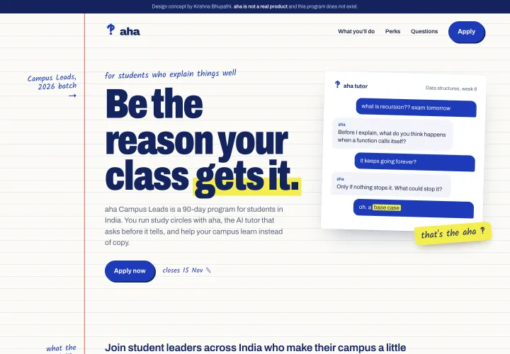
V1India only, the money in a list
A launch campaign for an AI tutor that asks before it tells, written to recruit students who already explain things to their friends.
aha is an AI tutor that answers a question with a question, so students work the answer out themselves. I designed the brand and a launch campaign for its Campus Leads program: a landing page, three emails, social posts and a set of twelve doodles, all built as working HTML and CSS. aha is not a real product and no figures here are real results.
Campus Leads is a paid, 90-day role for college students who run study circles. Everything had to recruit one person: a student who already explains things to friends, and who scrolls past anything that looks like an ad.
That ruled out the usual AI launch look of gradients, glowing chat bubbles and stock photos of smiling students. It had to feel like something a student made, and it had to answer the first question every student asks, "is it paid?", before anything else.
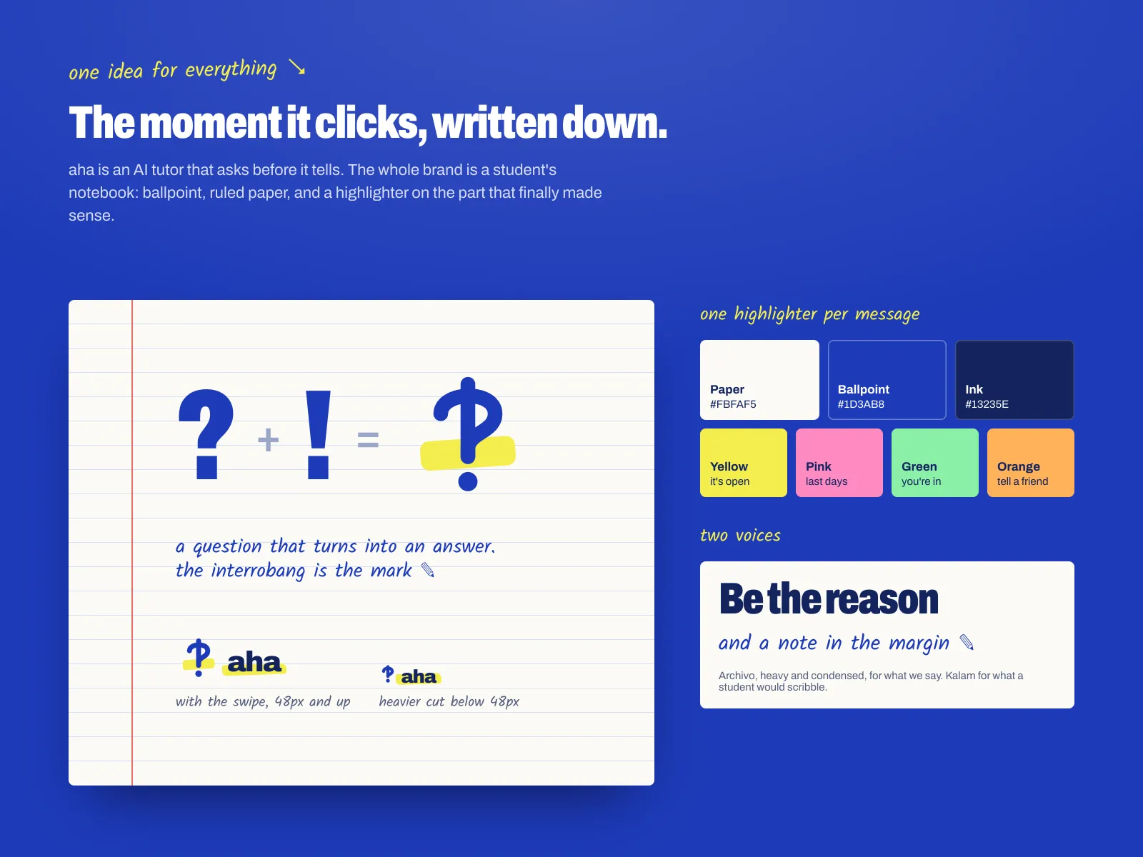
The brand is a student's notebook.
Ballpoint blue on ruled paper, a red margin, and a highlighter on the part that finally made sense. The mark is an interrobang, a question that turns into an answer, which is exactly what the product does.
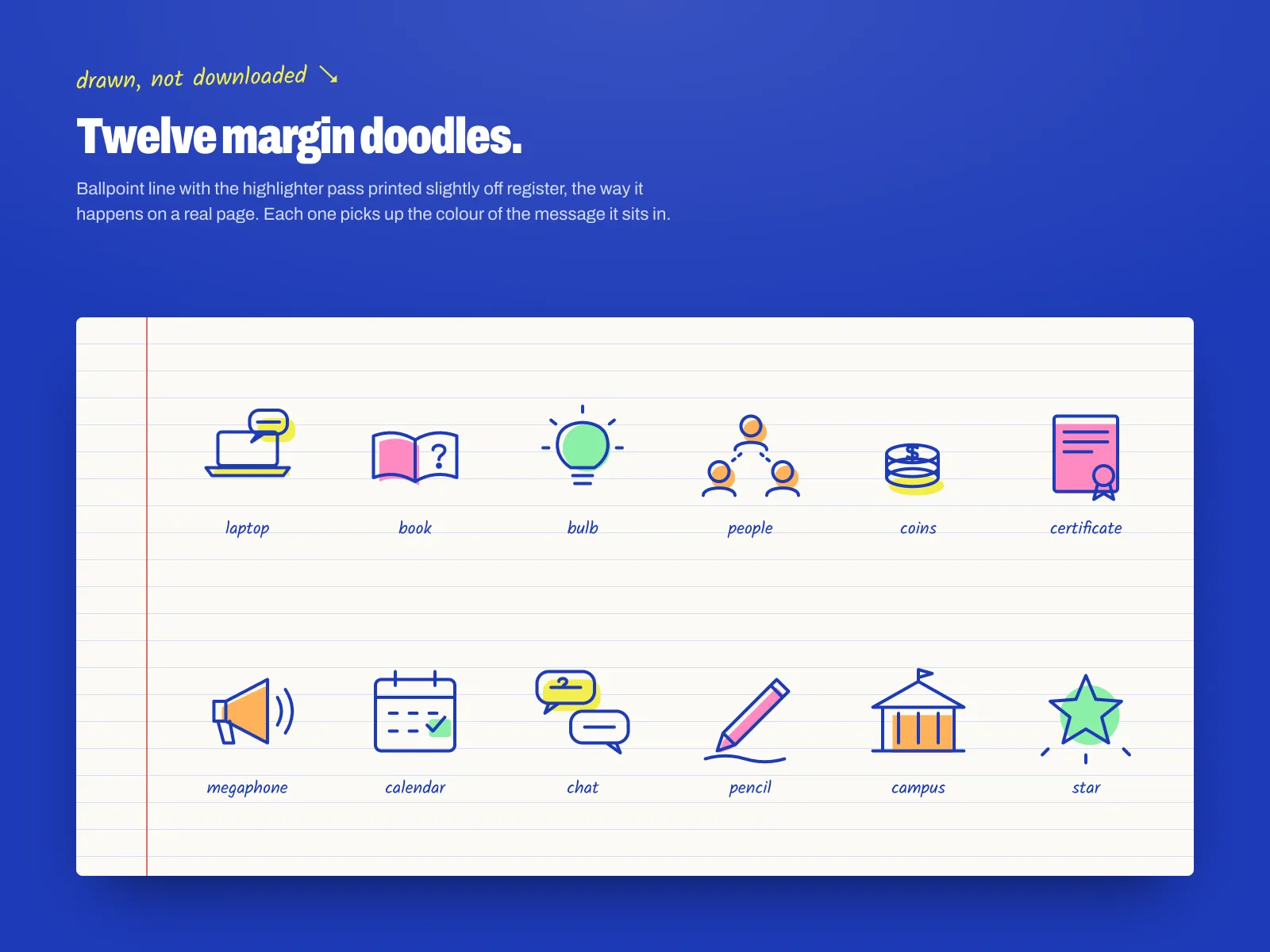
Twelve doodles, drawn as ballpoint lines with the highlighter printed slightly off register. They sit in the margins of every touchpoint and take on that message's colour.
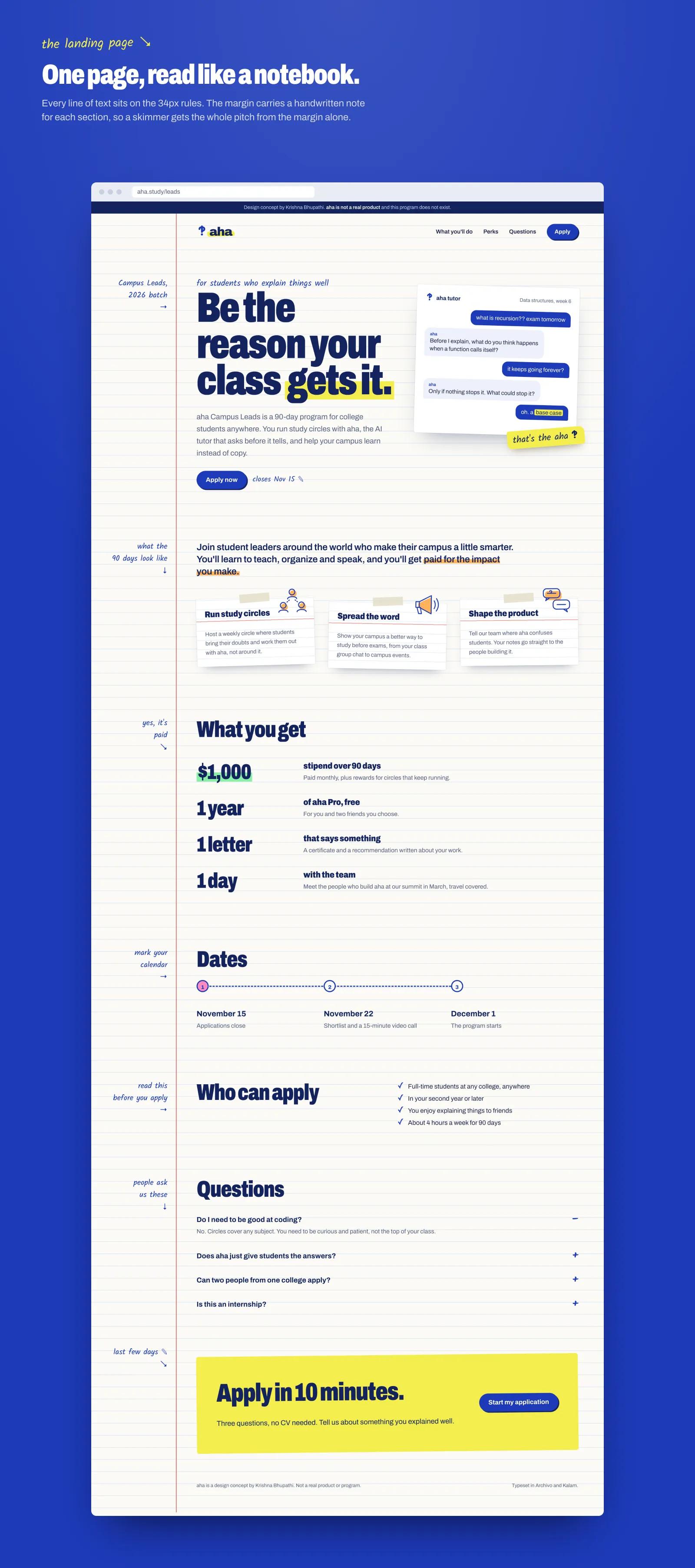
Every line of text sits on the page's 34px rules. The margin carries one handwritten note per section, so someone who only skims the margin still gets the pitch. The hero shows the product working: a real exchange where aha answers a question with a question.
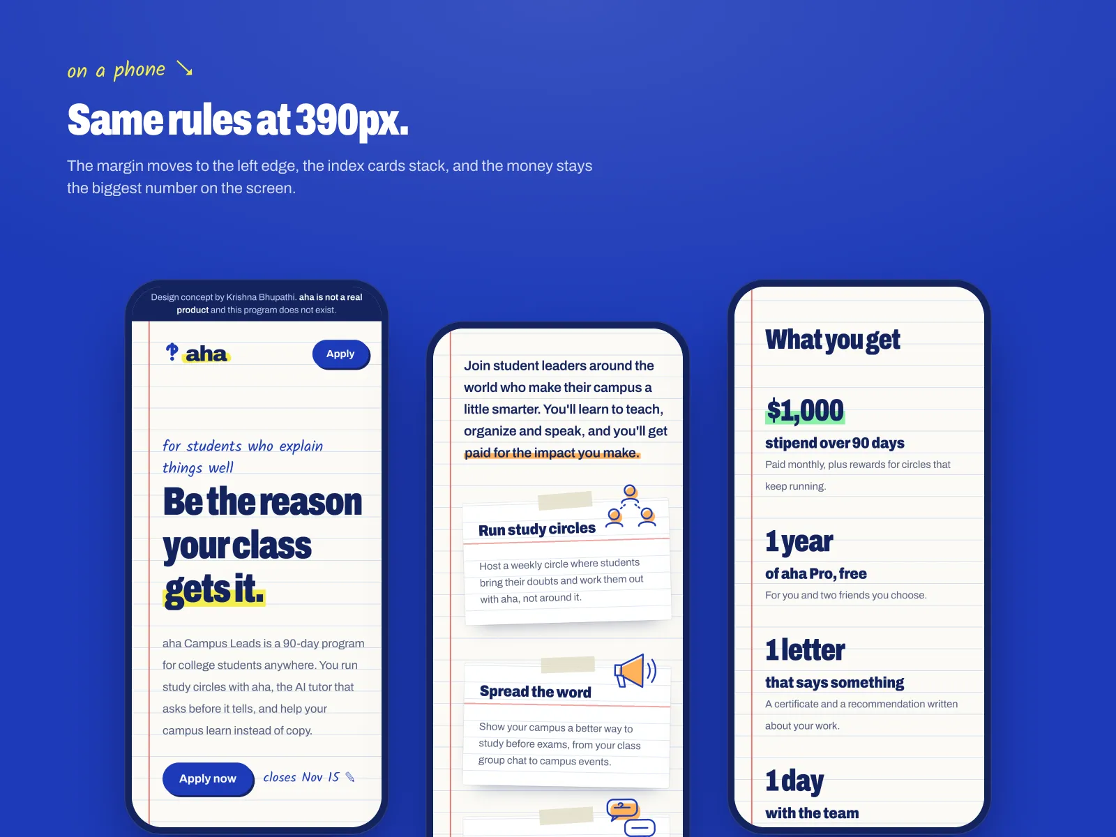
At 390px the margin moves to the left edge, the index cards stack, and $1,000 stays the biggest number on the screen.
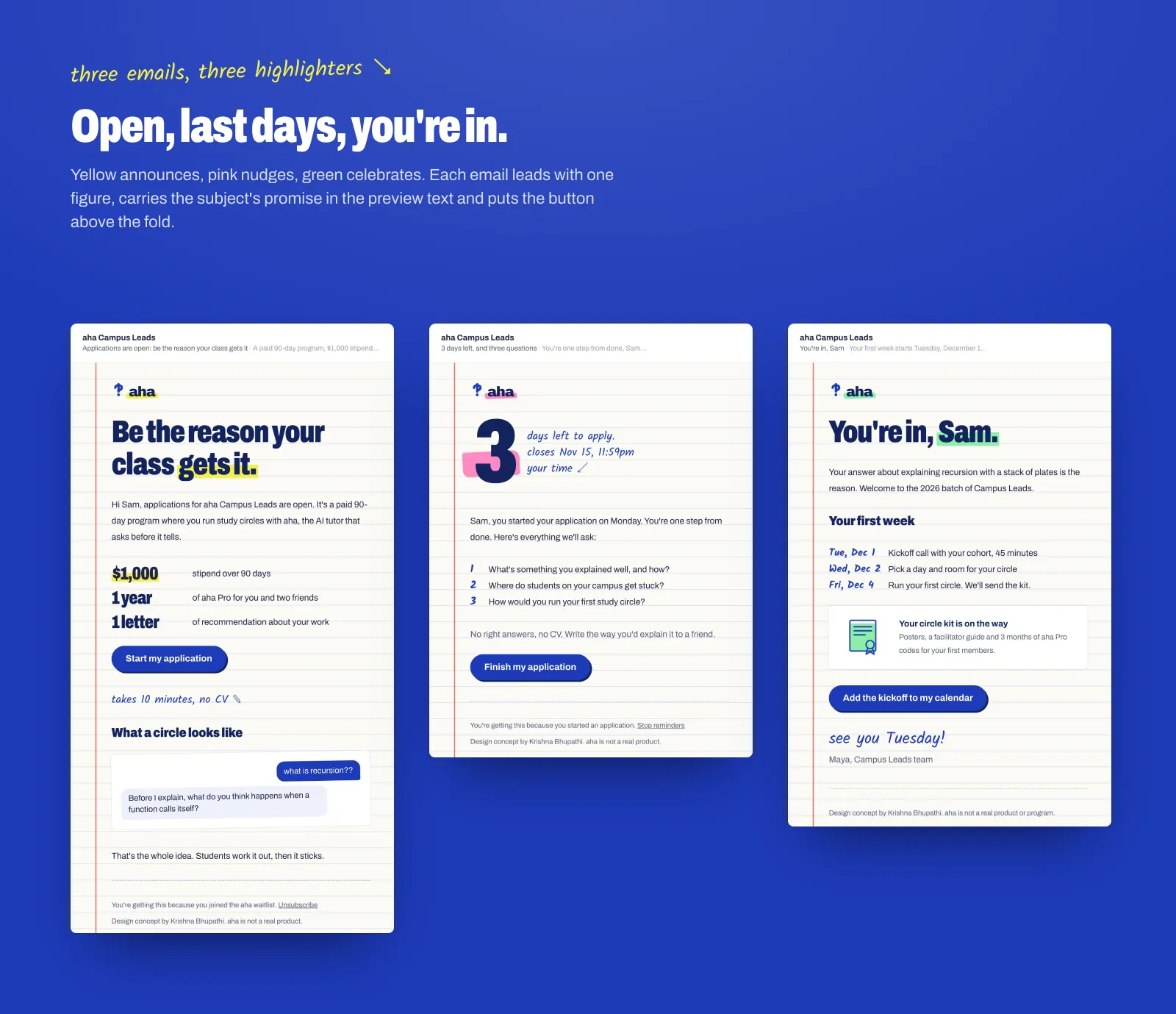
Three emails, one highlighter each: yellow when applications open, pink for the last days, green for "you're in." Each leads with a single figure, uses the preview text to finish the subject line's promise, and puts the button above the fold.
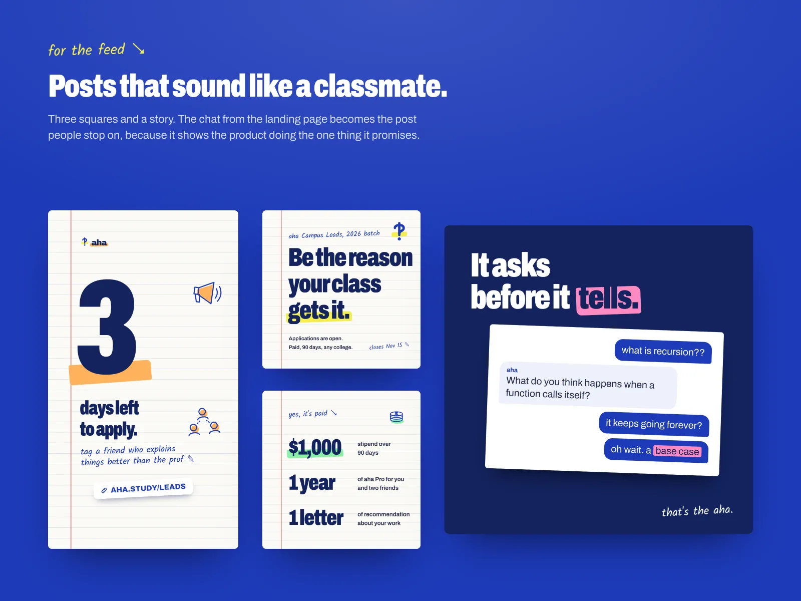
Three squares and a story. The post most likely to stop a scroll is the chat itself, because it shows the product doing the one thing it promises.
The first version of the landing page was written for students in India: a stipend of up to ₹50,000, a summit in Bengaluru, and study circles "from your class group to the fest stage." It worked as a local page, but the program had to read anywhere, so I rewrote it.
V1India only, the money in a list
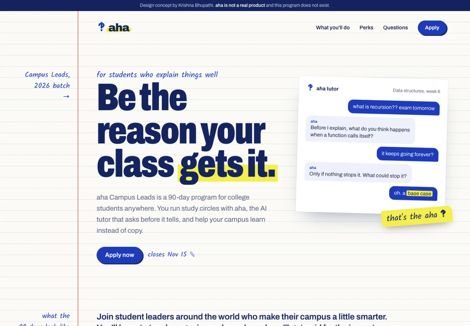
V2Global, the figures lead
In the first version the money sat inside a list. The rewrite leads each perk with its figure: $1,000, 1 year, 1 letter, 1 day. Students ask "is it paid?" first, so every touchpoint answers it before anything else.
Yellow, pink and green tell you where you are in the campaign before you read a word, and the doodles pick up the same colour.
The claims are set in Archivo. Kalam is only what a student would scribble next to them, so the page stays easy to read.
The doodles and the chat carry the personality. A photo of smiling students would have made it look like the ads it had to avoid.
Real students, a real program and a send list. With them, the first thing I'd test is the email subject lines, yellow against no highlighter at all, and whether the chat post beats the $1,000 post on saves. I'd also sit with three students and watch whether they read the margin notes or skip them.